Google Webfonts, The Spy Inside?

The FontFeed being a WordPress blog, an article mentioned by Erik van Blokland caught my attention. On his private blog web developer xwolf – alias for Wolfgang Wiese – wrote about an intriguing “side-effect” of the use of Google webfonts in the new WP3.8. Its recent introduction unveiled a refreshed back-end for the WordPress – it all looks indeed quite good and usability is satisfactory. However the developers did something that is not entirely fine in these times of constant surveillance and sourcing of metadata by official agencies and criminals alike. Along with the new back-end the use of Open Sans was introduced. When logged in, the fonts are not served locally but from Google webfonts. This creates privacy issues.

The HTML source code looks like this:

The justification for the decision to serve Google webfonts in the WP3.8 back-end can be found in the post Open Sans, bundling vs. linking on the WordPress website. The piece spawned a lengthy comment thread in which Kiwi WordPress developer Ryan Hellyer also pointed out the privacy issues.

I suspect that bundling scripts into WordPress core will create privacy concerns for many people. The ability to perform analytics via them will disturb a small segment of the user-base.

It may even be illegal in some countries. Germany springs to mind in regards to that. They’re already super ticked off about being spied on at the moment, so I think it might be best if WordPress doesn’t join the party too.

And yes, you can install a plugin to force them to be self-hosted, but many people will just unwittingly hit the “update” button without ever realising that they’re opening themselves up to privacy issues.

According to Wolfgang Wiese the solution is a plugin called Disable Google Fonts. As its name implies, its sole function is to prevent loading of Google webfonts by WordPress and bundled themes (Twenty Twelve, Twenty Thirteen, Twenty Fourteen). Wolfgang recommends that every single person who has a personal WordPress installation should immediately install the plugin too. Its developer Milan Dinić sums up a couple of reasons why you don’t want to load fonts from Google’s servers:

  • privacy and security (Google knows about each page view)
  • local development or production (no or limited Internet access)
  • availability of Google’s servers (some countries block access to Google)
  • language support (these fonts have limited characters support)
  • performance (Google’s servers are hit on each page view)

So what exactly is the problem? The problem is this provides Google Inc. – a company listed on the stock exchange whose core business is trading metadata – yet another “tracking station”. User access can be tracked by gathering at least the header data of the connection request. This also includes cookies from the Google domain. Google learns that someone has an Administrator or Editor account for a certain website, and has a relationship to that site. But not only Google. Other websites also use Google webfonts; some of them in their themes and some regular users. Furthermore certain websites integrate Google Adsense and use Google Analytics.

Similar to mobile positioning it is not possible to see where people go. But thanks to cookie IDs and alternatively from other unique data Google can “see” whether someone logs on on a website or if the other website simply is called on. If the account eventually calls on another website that allows Google to connect personal data to (for example Google+ or YouTube), then the company knows who owns that account.

It’s all about metadata after all. By itself, on one single website, this may seem harmless. But by collecting and merging the metadata of several websites comprehensive tracking becomes possible. And not only that – the fact that the WordPress folks now embedded Open Sans only in the back-end allows Google to gain a valuable attribute – it finds out whether there is a working relationship between the account (the owner) and the website.

In his post Wolfgang sarcastically thanks the design team at WordPress for delivering his personal data to Google for a minimal gain in performance. He cannot really understand why web designers would embed Google webfonts without thinking twice, opening themselves up to possible privacy issues simply because it is so beautifully simple and the download file for the current theme is smaller. Or because others do it this way.

Because he also owns themes, plugins and programmed his own CMS, Wolfgang knows very well how little effort is needed. He doesn’t get why it would be so hard to simply offer the option instead of having Google webfonts download by default. One can use Google webfonts with confidence, but should do it consciously, and include the option to switch them off. He thinks it’s just plain laziness or incompetence from web designers/developers, because all it takes is a few lines of code to make Theme Options.

Google is not the ultimate bad guy. Yet it should stick to its motto “don’t be evil”. If some day in the future the NSA waltzes in with a warrant or if economic interests come to the fore. There have been other companies that once were “good”, but became less savoury due to changes in management.

Read the original article in German here.

Gå till webbsidan »

Google Webfonts, The Spy Inside?

The FontFeed being a WordPress blog, an article mentioned by Erik van Blokland caught my attention. On his private blog web developer xwolf – alias for Wolfgang Wiese – wrote about an intriguing “side-effect” of the use of Google webfonts in the new WP3.8. Its recent introduction unveiled a refreshed back-end for the WordPress – it all looks indeed quite good and usability is satisfactory. However the developers did something that is not entirely fine in these times of constant surveillance and sourcing of metadata by official agencies and criminals alike. Along with the new back-end the use of Open Sans was introduced. When logged in, the fonts are not served locally but from Google webfonts. This creates privacy issues.

The HTML source code looks like this:

The justification for the decision to serve Google webfonts in the WP3.8 back-end can be found in the post Open Sans, bundling vs. linking on the WordPress website. The piece spawned a lengthy comment thread in which Kiwi WordPress developer Ryan Hellyer also pointed out the privacy issues.

I suspect that bundling scripts into WordPress core will create privacy concerns for many people. The ability to perform analytics via them will disturb a small segment of the user-base.

It may even be illegal in some countries. Germany springs to mind in regards to that. They’re already super ticked off about being spied on at the moment, so I think it might be best if WordPress doesn’t join the party too.

And yes, you can install a plugin to force them to be self-hosted, but many people will just unwittingly hit the “update” button without ever realising that they’re opening themselves up to privacy issues.

According to Wolfgang Wiese the solution is a plugin called Disable Google Fonts. As its name implies, its sole function is to prevent loading of Google webfonts by WordPress and bundled themes (Twenty Twelve, Twenty Thirteen, Twenty Fourteen). Wolfgang recommends that every single person who has a personal WordPress installation should immediately install the plugin too. Its developer Milan Dinić sums up a couple of reasons why you don’t want to load fonts from Google’s servers:

  • privacy and security (Google knows about each page view)
  • local development or production (no or limited Internet access)
  • availability of Google’s servers (some countries block access to Google)
  • language support (these fonts have limited characters support)
  • performance (Google’s servers are hit on each page view)

So what exactly is the problem? The problem is this provides Google Inc. – a company listed on the stock exchange whose core business is trading metadata – yet another “tracking station”. User access can be tracked by gathering at least the header data of the connection request. This also includes cookies from the Google domain. Google learns that someone has an Administrator or Editor account for a certain website, and has a relationship to that site. But not only Google. Other websites also use Google webfonts; some of them in their themes and some regular users. Furthermore certain websites integrate Google Adsense and use Google Analytics.

Similar to mobile positioning it is not possible to see where people go. But thanks to cookie IDs and alternatively from other unique data Google can “see” whether someone logs on on a website or if the other website simply is called on. If the account eventually calls on another website that allows Google to connect personal data to (for example Google+ or YouTube), then the company knows who owns that account.

It’s all about metadata after all. By itself, on one single website, this may seem harmless. But by collecting and merging the metadata of several websites comprehensive tracking becomes possible. And not only that – the fact that the WordPress folks now embedded Open Sans only in the back-end allows Google to gain a valuable attribute – it finds out whether there is a working relationship between the account (the owner) and the website.

In his post Wolfgang sarcastically thanks the design team at WordPress for delivering his personal data to Google for a minimal gain in performance. He cannot really understand why web designers would embed Google webfonts without thinking twice, opening themselves up to possible privacy issues simply because it is so beautifully simple and the download file for the current theme is smaller. Or because others do it this way.

Because he also owns themes, plugins and programmed his own CMS, Wolfgang knows very well how little effort is needed. He doesn’t get why it would be so hard to simply offer the option instead of having Google webfonts download by default. One can use Google webfonts with confidence, but should do it consciously, and include the option to switch them off. He thinks it’s just plain laziness or incompetence from web designers/developers, because all it takes is a few lines of code to make Theme Options.

Google is not the ultimate bad guy. Yet it should stick to its motto “don’t be evil”. If some day in the future the NSA waltzes in with a warrant or if economic interests come to the fore. There have been other companies that once were “good”, but became less savoury due to changes in management.

Read the original article in German here.

Gå till webbsidan »

Undergrad, Cooper, KABK — One Student’s Road to Learning Type Design

In 2009, after 13 years as a self-employed graphic designer, I decided to abandon the professional world and go back to school — this time to pursue a field that seems related, but is an entirely separate discipline: typeface design.

Although a lot of type designers are self taught and quite successful, I was looking for the opportunity to study letterforms and their construction for an intense and uninterrupted period of time, something you can’t do while working full-time. After attending three type design courses over the last four years I’d like to share my experience with others who are considering a career in the field.

My intent is to give you a quick insight into what you might experience from each course.

I won’t dig into much detail about individual projects. (They are heavily documented on other blogs, they often change, and it’s nice to have some surprises if you attend.) Instead, my intent is to give you a quick insight into what you might experience from each course, so you’ll be in a better position to decide which one or two might be best for you, and to help answer some of the questions I had before applying. There are a few handy tips in here, too.

The following three courses are a part of my journey to pursue type design as a career path.

MelbNYCTheHague

Undergraduate: The Warm Up

My first experience with designing letterforms was when I enrolled in the undergraduate Digital Font Design unit VCO3305 at Monash University in Melbourne, Australia. You join the Bachelor of Communication Design students that chose the type design unit as an elective for a four hour class each week for one semester — approximately twelve weeks. You begin each class with an hour lecture, then you have three hours studio time to work on your project. A minimum of an extra nine hours during your week is required to complete the assignments.

This unit teaches the basic skills of using a font editor (at the time we used FontLab, now they are using RoboFont), an introduction into type construction, spacing, and some type design history. Our assignments included creating a modular font (A–Z, 0–9), a brush- or pen-inspired font, and finally a self-initiated project. In each you are encouraged to expand the character set to include upper and lowercase, numerals and punctuation. A research assignment on an existing typeface to present to the class was also a part of the assessment. For our final submission we designed a small specimen for each font we created.

If you are living in Australia, I highly recommend this course as a good introduction to type design while still having the ability to continue your freelance work. And for those living elsewhere, the good news is that undergraduate courses with a focus on type design are becoming more common. Check in with your local university or art school.

Type@Cooper: The Sprint

For those seriously interested in creating type, the Type@Cooper Condensed Postgraduate Certificate in Typeface Design might be for you. This course, based in New York, is a five week type design bootcamp for fifteen selected participants from around the world. The course is setup especially for international students, so be prepared to benefit from new lifelong friends at your future travel destinations.

Type@Cooper condensed class of 2011 with teachers Sara Soskolne, Cara Di Edwardo, Sumner Stone, and guest lecturer Matthew Carter.

Type@Cooper condensed class of 2011 with teachers Sara Soskolne, Cara Di Edwardo, Sumner Stone, and guest lecturer Matthew Carter.

Type@Cooper is an intense course from day one. It compacts the contact hours from the yearlong Extended program into five weeks! You will work around twelve hours a day, seven days a week to keep up with these guys. The moment you arrive at Cooper you start drawing type. We worked with the broad nib pen and brush to learn the basic structure of roman letterforms before moving onto developing our own typeface.

The historic Cooper Union Foundation Building in New York City.

The historic Cooper Union Foundation Building, New York.

History and theory is taught with visits to many of New York’s famous libraries and museums and the amazing Herb Lubalin Study Centre of Design and Typography located in the beautiful Cooper Union building.

This course will truly test your interest in type, giving you the opportunity to work on your own typeface for the duration of the course. You are required to present your progress to your teachers and fellow classmates on a regular basis while learning how to constructively critique the work of others. Your teachers at Type@Cooper are among the best type designers in the world, so you are in extremely good hands. My experience at Type@Cooper gave me a solid understanding of history, construction, spacing, digitization using RoboFont, and some basic font production and Python coding. I highly recommend this course if you are ready for a challenge and prepared to put your working life aside for five invigorating weeks.

The application process is seamless and you will find out if you’ve been excepted before or on the date they publish. I submitted a folio of typographic work, including my first attempts at type design from the course at Monash University. I showed I was able to find my way around a font editor and had an understanding, and a substantial interest in creating type.

Once you’ve been accepted you will need to find accommodation in New York, which is not cheap and is a little bit of a challenge. I arrived in the city and stayed in a hostel for a week while looking for a place, but I would recommend trying to secure something before your arrive. I finally found a share-house on CraigsList in East Village within walking distance to Cooper Union which proved to be very handy after a long day of drawing type. It’s also good to be close to other classmates so you can work together on weekends and grab a beer and a meal after class. When you’re accepted, try to link up with each other on Facebook and Twitter before you arrive.

KABK: The Full Marathon

Type and Media at The Royal Academy of Art (KABK) in The Hague, The Netherlands, is the granddaddy of type design courses. It’s like Type@Cooper on steroids. The yearlong master’s study is intense, and the intensity expands the full year. They offer you the chance to put your life on hold and focus purely on type, learning from the best type designers in the field. Holidays are really not holidays and weekends are pretty much for working. This is the first time in my life where I lost track of days, and where weekends blended into the working week. Having said that, if you like type you will enjoy every minute!

The Royal Academy of Art, The Hague, The Netherlands.

The Royal Academy of Art, The Hague, The Netherlands.

Each teacher has different (sometimes conflicting) ideas and methods of working. It puts you in a position to find your own direction.

Taught in English, Type and Media is a combination of experiences designed to allow you to distill your own way of working and producing typefaces. It’s not a course where you are hand-held and shown “the way” to do things. Each teacher has different (sometimes conflicting) ideas and methods of working. It puts you in a position to find your own direction. Looking back, it feels like every experience had a purpose and the structure was a truly tested one.

Pen work and sketching is a big part of this course. The broad nib pen, flexible pointed pen, and hammer and chisel were tools we got to know from the start. Sketching, sketching, and more sketching was encouraged for exploring ideas before any digitization. The TypeCooker website was a tool we used often for pushing the limits on what you can achieve when mixing different type parameters. We had a lot of fun and many wild ideas were hatched during these classes.

The research side of things is not forgotten. Trips to libraries and museums in The Netherlands, Belgium, France, Germany, and the UK led us to the elusive names and history of forgotten pre-nineteenth-century typefaces.

The major project in the second half of the year is where all that you’ve learnt and experienced during the first half of the year is focused. This is your opportunity to put it all into practice and develop a fully-working typeface of your choice. Presenting your ideas and progress is an important element in the process. We met regularly with our teachers and classmates to show where we were at and to explain our journey. Your classmates’ experiences are also important to your own progress throughout the year.

Type and Media graduating class of 2013 with teacher Jan Willem Stas.

Type and Media graduating class of 2013 with teacher Jan Willem Stas.

Students from eleven different countries were plucked out of our everyday lives and placed in a pressure cooker for a year.

Many hours are spent with your fellow classmates, and they become your family. Students from eleven different countries were plucked out of our everyday lives and placed in a pressure cooker for a year. Not only do you learn about type here, you also learn about different cultures, personalities and a lot about yourself. Don’t expect to come out of this course the same person as when you went in. There is not much time to meet outsiders, so operating as a team, functioning happily and productively, is an important part of this unique experience.

Getting into Type and Media is a battle in itself. With over 150 applicants each year being one of the twelve selected was a great honor. The application process involved submitting a letter of motivation to attend. Basically you have to convince them that you have enough interest and experience to be considered for the enduring time ahead. After submitting your application, don’t be disheartened if you don’t hear back from them immediately, or if at all. But waiting to hear if you’ve been accepted is quite painful. It will not necessarily be on the date that they publish, but you will hear back from them eventually. Keep an eye on the @typemedia twitter account — sometimes this hints at where they are in the application process. If you’re not accepted, but you’re still serious about attending, don’t give up. Improve your skills and try again the next year. You won’t be the first person to have applied a couple of times before getting into this course.

Once accepted, you will need to organize your big move to The Netherlands. This can be quite a task if you don’t speak Dutch (Nederlands) as all governmental and business correspondence is written in the local language. Having said that, most Dutch-speaking people are also happy to speak in English, and Google Translate will become your best friend for all written documents. Be sure to get in contact with the graduating students as they can help you with any questions you might have, including lodging. There are a few “unofficial” Type and Media houses that have been passed down from previous students which makes life a lot easier — especially if you are not from Europe.

Type and Media is truly an experience you will carry with you for the rest of your life. I highly recommend this course if you intend for type to be a big part of that journey.

Choosing Your Own Path

I decided on these three courses over other type design programs because of the hands-on experience they offer. While there is a different level of theory included in each, making type is what they are all about.

One important distinction is that they focus mainly on designing Latin typefaces. Still, at Type and Media I spent some time designing a Greek and my revival project was a Javanese typeface. Whatever your interest in non-Latin type, in my opinion, learning the principles of type design and exploring shapes initially is most important. Once you have this under your belt, exploring other scripts become more about understanding the language, its script, and how it’s used.

But my path may not be yours. Before you choose a program, check out these other specialized type design courses around the globe:

Argentina
Universidad de Buenos Aires (Buenos Aires)
CDT-UBA, Carrera de especialización en Diseño de Tipografía

France
École Estienne (Paris)
DSAA Création Typographique
École supérieure d’art et de design, ESAD (Amiens)
Post-diplôme Systèmes graphiques, langage et typographie

Germany
Hochschule für Grafik und Buchkunst, HGB (Leipzig)
Klasse für Type-Design

Switzerland
École cantonale d’art de Lausanne, ECAL (Lausanne)
MA Art Direction: Type Design
Zürcher Hochschule der Künste, ZHdK (Zürich)
CAS Schriftgestaltung
MAS Type Design and Typography

Mexico
Centro de Estudios Gestalt (Veracruz)
Maestría en Diseño Tipográfico

United Kingdom
University of Reading (Reading)
MA Typeface Design


Gå till webbsidan »

Recently Received

Italo Lupi via #grainedit

This week we’re excited to feature titles from Corraini Edizioni, Nobrow, Laurence King and Princeton Architectural Press. See all the books after the jump.


Italo Lupi via #grainedit

Italo Lupi via #grainedit

Italo Lupi: Graphic Autobiography
By Italo Lupi / Published by Corraini Edizioni
376 pages / Text in English and Italian

Graphic autobiography is a comprehensive volume which tackles Italo Lupi’s prolific output, from his work in publishing to small architectural projects, urban design and, above all, his  museum exhibitions.

Pick up a copy at Corraini Edizioni or your locak book shop.


Piero Fornasetti via #grainedit

Piero Fornasetti via #grainedit

 Piero Fornasetti: One hundred years of practical madness
Curated by Barnaba Fornasetti / Published by  Published by Corraini Edizioni
200 pages / Text in English and Italian

Painter, engraver and printer, designer, collector, stylist, refined craftsman, art gallery manager and exhibition promoter, Piero Fornasetti was an extremely rich and complex personality. He designed and made approximately 13,000 objects and decorations. His world is animated by the rigour of project, of art and craftsmanship, but also by unbridled fantasy, surrealist invention and poetry.

The book accompanies the exhibition of the Triennale Design Museum, curated by Barnaba Fornasetti, the first grand and unprecedented exhibition in Italy of the artist’s work.

Pick up a copy at Corraini Edizioni or your local book shop.

London Deco via #grainedit

London Deco via #grainedit

London Deco via #grainedit

 London Deco
By Thibaud Herem / Published by Nobrow
22 pages/ English

Join architectural illustrator Thibaud Herem as on a journey through the streets of London to discover the capital’s most intriguing, striking and elaborate art deco buildings. From imposing Orwellian giants to the hidden jewels of the thirties, Herem takes us on a tour of London’s forgotten Deco landmarks in an art edition of giant proportions.

Available at Amazon, Nobrow or your local book shop.


How to be an Illustrator via #grainedit

How to be an Illustrator (2nd Edition)
By Darrel Rees / Published Laurence King
168 Pages / Text in English

This book offers practical help and guidance to aspiring illustrators. All areas of the job are covered – how to create a portfolio; the most effective ways to approach would-be clients; how to prepare for meetings and negotiate contracts; and how to handle, deliver, and bill a job. There is advice on how to avoid the pitfalls that can undermine crucial first impressions; how to set up a studio; and how to maintain a flow of work and manage one’s time and cash. Success in self-promotion, creating websites, self-publishing, and the pros and cons of agents are all explored.

Pre-order a copy at Amazon, Laurence King or your local book shop.

gridguide

Grids & Guides via #grainedit

Grids & Guides: A Notebook for a Visual Thinkers
Published by Princeton Architectural Press
160 Pages 

Map out graphs, schematics, sketches, and dreams with this sleek and durable workbook. Inspired by vintage laboratory notebooks, Grids & Guides features 144 pages of graph paper (eight designs repeating throughout) interspersed with a multitude of scientific charts, tables, and infographics featuring everything from the periodic table to alternative alphabets to Newton’s Laws of Motion.

Pre-order a copy at Amazon, Princeton Architectural Press and your local book shop.


——————–

Also worth viewing…
2013 Book Gift Guide
Wim Crouwel: A Graphic Odyssey
Recently Received Books

Not signed up for the Grain Edit RSS Feed yet? Give it a try. Its free and yummy.


Share on FacebookShare on Facebook

Thanks to Mister Retro: Machine Wash Deluxe for being this week’s sponsor.

Gå till webbsidan »

ScreenFonts: Inside Llewyn Davis, The Secret Life of Walter Mitty, Saving Mr. Banks, The Wolf of Wall Street

Two days ago the nominations for the Oscars were announced, yet still no sign of any typography-related categories like Best Movie Poster or Best Title Sequence. On the IMP Awards website the nominees for the 2013 Internet Movie Poster Awards have been revealed; we will know who won this Tuesday, January 21st. The categories I look most forward to are Bravest Movie Poster and Worst Movie Poster, for obvious reasons. Talking about bad movie posters, according to Yahoo! Movies 2013 was a bizarre year of movie ad controversies – racist artwork for The Sapphires and on the Italian posters for 12 Years A Slave, an unnaturally slimmed-down Melissa McCarthy for The Heat, a poster for the biopic Diana at the entrance of the Paris tunnel where she tragically died in the fatal car accident, and the funny incident of a homo-erotic fan-made poster for Thor 2: The Dark World mistakenly making it into a theater in Shanghai.

I am sorry to disappoint you: I have no such juicy bits in this installment of ScreenFonts. Only one minor controversy, yet as it turns out it is not even a genuine one. Appearances can be deceiving, and the particular case of White Reindeer proves you should never jump to conclusions (something I have been guilty of myself, so I am not pointing any fingers).

The image of a young Bob Dylan wandering through New York City with his guitar is engraved in our shared cultural consciousness – remember I write from a white male European/Anglo-centric perspective. By referencing this iconic imagery the movie poster for Inside Llewyn Davis takes a clever shortcut to the viewer’s understanding. With a minimum of means it gives a maximum of information, effortlessly establishing the theme of the movie.

The eclectic letters are made to look like a hodge-podge of two or more similar-yet-not-identical wood type sans serifs, as if the print shop used leftovers from different typecases. This enhances the DIY, shoestring-budget visual language often associated with folk music. Christian Schwartz explored such “willfully uneven” typographic texture with Local Gothic which includes a random feature. In contrast it is a shame repeating characters on this poster are identical because it contradicts what the designer was trying to achieve. Manually mixing letters from typefaces like ATF Franklin Gothic, Clearface Gothic, Alternate Gothic and so on would have yielded a more authentic-looking result. The movie title is one of those compact sans serifs with an unfortunate enlarged I. Why? Not only is it unnecessary; if it is indeed an artificial small cap it makes no sense to not have the name of Llewyn Davis capitalised as well. Weird…

Breakfast with Curtis tells the story of an offbeat community of bohemians who welcome an introverted, young neighbour named Curtis into their world. I love the playful assemblage in the collage-like alternate poster, merging hi-tech – technical drawing and processed photography – with lo-tech – silkscreened background and visible pieces of tape holding the artwork together. The typeface reminds me of Pennsylvania, another one of Christian Schwartz’ faces.

The festival poster for White Reindeer was illustrated by Anna Bak-Kvapil, and art directed by director Zach Clark, who also selected the typeface.

Anna Bak-Kvapil | “The director had a very clear idea of what he wanted for the poster, right down to what outfit Suzanne (Anna Margaret Hollyman) should be wearing. I’m always happy when someone is really specific about what they want, so for me it was just a matter of making a few suggestions. I thought it would give her figure a little more intention if she was holding something symbolic to the film; Suzanne eats candy canes throughout the movie, so a candy cane seemed like the ideal simple prop. And I wanted the whole piece to subtly feel like a Catholic prayer card, since the film wrestles with issues of morality and redemption, hence the light blue color I always associate with the Virgin Mary, and the slight suggestion of a halo around Suzanne’s head, formed by the snow and echoed by the Christmas lights. The illustration has an innocence to it that doesn’t even hint at what the film is really about (murder, orgies, strippers, coke). It’s a portrait of someone the second before their life falls apart, it’s Suzanne on the threshold of trauma and transformation.”

The loose, elegant brush script on the poster is Imitation by Harold Lohner, an interpretation of the hand-lettered titles of the film Imitation of Life, (1959, directed by Douglas Sirk, art-directed by Richard H. Riedel). Originally a lowercase-only face, it spawned two alternate versions with capitals. The first set of capitals is based on ImageLine’s “Dance of the Brush”, which in turn appears to be have been inspired by the work of Charles Bluemlein; the second set re-imagines the titles of another Lana Turner/Universal soap opera Madame X (1966, directed by David Lowell Rich, art directed by Alexander Golitzen and George C. Webb).

The beautiful main poster – lovely coloured-in black-and-white atmosphere – was designed by Brandon Schaefer, whose designs surfaced on ScreenFonts a number of times this year.

Brandon Schaefer | “White Reindeer tells the story of a young woman whose life is thrown into chaos after a tragedy befalls her leading up to Christmas day. It’s funny, and cleverly plays with the holiday in which it is set, but there’s a darkness to the humor that distances it from the saccharine-filled mush that sits at the heart of most yule-tide classics. And there’s a fair amount of cocaine.”

“The idea for the poster is fairly straightforward – cocaine lines as a Christmas tree, a way of pulling together two disparate elements together in a way that hints at what the film itself sets out to do in its own way. Bob Gill’s approach to design as idea has been a huge influence on me, and for once it was nice to be able to work out a solution that felt simple and inevitable.”

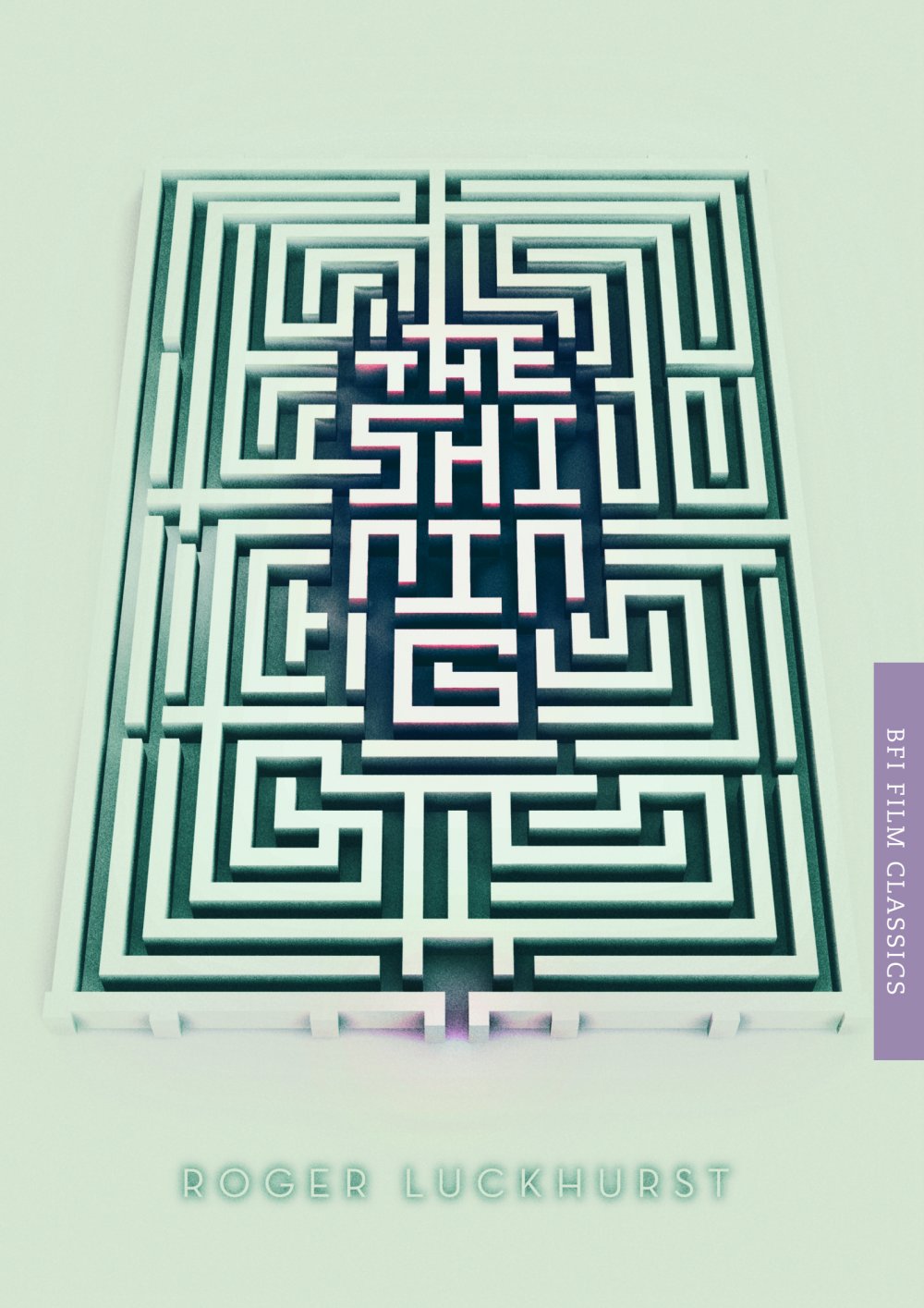
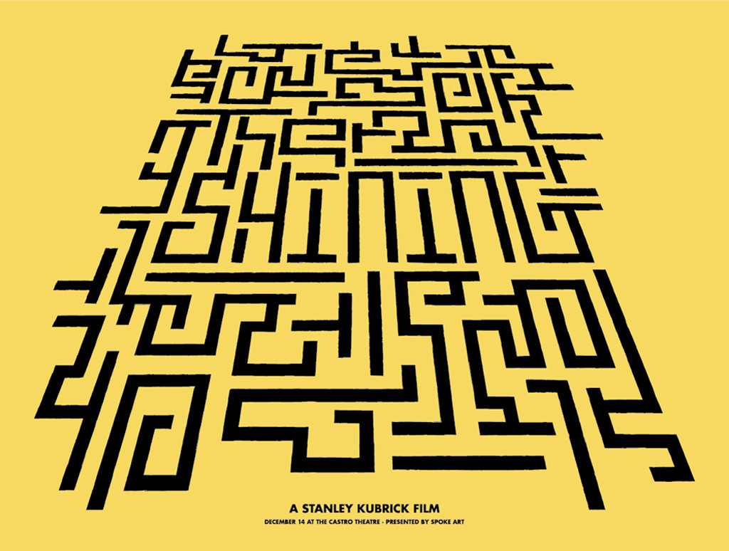
Brandon Schaefer | “Months after it was finished someone pointed out to me that my artwork bore a resemblance to a poster for Filth, where a character climbs a ladder of cocaine. After searching out the poster, while I didn’t feel that my design was a copy, I can appreciate the idea that multiple discovery doesn’t just hold true in science, but also design. I found the same to be true when BFI released a book jacket for The Shining that independently shared some DNA with a poster I’d done a year before. The same thing occurred years prior on a poster re-release I did, with a package design coming out months later running with a similar theme. Maybe the strangest example is stumbling upon a Heinz Edelmann poster from the 1960s that looks like the long lost twin to one of my ‘Berberian’ comps.”

“I think many people out there are often too ready to dismiss something as theft. Maybe because the internet offers so much at our fingertips that it is hard not to be cynical of other people’s motivations, especially when barely a week goes by without someone sharing a story of how their work has been compromised. I try to be open-minded, though, because in my experience, weird coincidences do occur.”

On the subject of multiple discovery – completely unrelated but very funny is the uncanny resemblance between one of this month’s posters in the extensive marketing campaign for The Secret Life of Walter Mitty, setting the main character in all kinds of adventurous settings, and last month’s superb design for Diana. Made me smile.

Most of the posters for Venuto al mondo (Twice Born) are unremarkable at best and not very good at worst, with Trajan and Gotham in their obligatory roles. The one exception is this delightful design by Paris-based independent graphic design agency Le Cercle Noir. The olive-tinted photograph on the virginal white background is not only very classy, it somehow infuses the image of Emile Hirsch embracing Penelope Cruz with an undeniable melancholy, increasing its emotional impact. The positive/negative all-caps setting of the movie title at its bottom is suitably elegant; the delicate features of Bodoni adds to the refinement of the poster. Personally I would have preferred a contemporary Didone for a change.

Typographically speaking this second case of a so-and-so main poster and a fabulous alternate design is far more interesting. The poster for the Cannes launch of The Selfish Giant was designed UK agency All City Media. The gritty neo-industrial setting of the film is deftly transformed into stylised, retro-looking graphics in primary colours that seem to come straight out of an annual report from the sixties. Instead of resorting to the obvious Helvetica or Futura, All City Media decided in favour of a contemporary alternative. Replica performs the same function as a classic neo-grotesque or geometric sans, yet its subtly squat features and cut-off corners at the bottom of the ‘A’ enhance the industrial look of the artwork. This makes me very happy.

The idea of attaching a Mickey Mouse shadow to Walt Disney and Mary Poppins to P.L. Travers on the movie poster for Saving Mr. Banks is kind of cute. What intrigued me though was the Trajan alternative which I eventually managed to identify as Anavio.

The identifier “Trajan-alternative” is particularly appropriate in this instance, as for some reason the movie logo was recreated using Trajan. To achieve a similar typographic image the legs of the ‘K’ and the ‘R’ were extended. I have no clue why this was done instead of simply using the original typeface. By doing so it becomes apparent how much alike both type designs are in terms of basic structure, yet how the design details make them two distinctly different typefaces.

Another exceptional collaboration between a filmmaker and this time an actress is the subject of Liv & Ingmar, the documentary relating the 42 year long relationship between legendary actress Liv Ullmann and Ingmar Bergman. The rigid geometry of ITC Avant Garde Gothic belies the poetic imagery of the movie poster. Stylistic alternates for the ‘A’ and ‘V’ were used to nest the ampersand snuggly between the two names. It makes sense but the end result looks a little forced.

Ahí va el diablo (Here Comes The Devil) gets a great vintage-looking movie poster conjuring up the horror classics from the seventies and eighties. The typographic lockup is solid, perfectly scaled and positioned in relation to the ominous silhouette of the mountain with the two children on top, and the forest of outstretched hands mimicking flames at the bottom. It is weird to notice how my opinions change about certain typefaces – I was never a fan of the ITC faces from that period, but the more I see it used well, the more I’ve come to appreciate ITC Serif Gothic. In small doses, and only in appropriate situations of course.

More flames – in their efforts to outdo each other, designers for the entertainment industry continually devise new visual effects to crank up the awesomeness of the marketing collaterals they create. Not content anymore with mere sparks that have prettified many a poster for an action flick these past few years, the movie poster for Bollywood action extravaganza Dhoom: 3 one-upped the competition by setting the actors on fire! What is going to top that!? Lava hats?


47 Ronin by Matt Ferguson

The fourth Poster Posse (Phase 1 and Phase 2) at Blurppy – the ongoing project by the self-proclaimed “purveyor of pop culture” that yielded some great alternate designs for Pacific Rim last summer – “tackles the supernatural, demons, samurai and Keanu Reeves” with a series dedicated to 47 Ronin. My favourites this time around are by Midnight Marauder, Doaly, and Matt Ferguson who relied on his trusted Futura for the typography.


47 Ronin by Midnight Marauder


47 Ronin by Doaly

I feel a teensy bit let down by this installment of the Poster Posse. Yes, most of them have great illustrations, but some are lacking in the design/typography department. For example the astonishing art Paul Shipper produced doesn’t take away that he conveniently tucked away the typography really small in the right-hand bottom corner. That is not poster design, that is a cop-out. It is also a shame that the brush scripts some designers used to reference Japanese calligraphy are of inferior quality – in my opinion the best typefaces to simulate this still are Gizmo and many of the brush scripts by Timothy Donaldson.

The rather bland theatrical poster (floating heads! dramatic poses! more fire!) uses a slightly customised Bank Gothic.

I am with Stephen Coles on this one. Not only is this poster for The Wolf of Wall Street unimaginative, the typography is surprisingly poor for such a high-profile movie, the new collaboration between iconic director Martin Scorcese and teen-heartthrob-turned-major-movie-star Leonardo DiCaprio. I fail to see the reason to have a yellow field surrounding the movie title set in all-caps FF DIN. It immediately conjured up associations with road works, rather than the stock exchange which is the setting for the film. The typographic lock-up seems hastily thrown together, and – just like Stephen observes – there is some unnecessary squooshing of type involved.

Even though they are much better designed, these minimalist posters look a bit gratuitous. Literally playing off the movie title by integrating a wolf silhouette… Come on, admit it doesn’t really add anything substantial. Instead of making me go “Aha!” these two designes elicited a meager “Meh…” from me. The typeface is ITC Century.

We end this episode in true FontShop style with this second batch of yellow-and-black movie posters, for Grudge Match. Nice concept, however the execution falls short. The coloured-in black-and-white treatment of the photos matches the visual style of vintage boxing posters. Unfortunately it makes half of the actors in them barely recognisable. I also don’t buy the choice in typefaces. Instead of going for Helvetica they would have been so much better off with a chunky wood-type inspired face in various weights and widths like Rhode or Titling Gothic, or something grittier like Garage Gothic.

Gå till webbsidan »