CAP&Design är kategorisponsor för Design-kategorierna – här är deras nominerade bidrag:
Vi läser, inspireras och delar med oss från typografivärlden. Hör av dig om du vet någon bra källa till nyheter. Lämna en kommentar eller kontakta oss.
Kureras av Jörgen Gedeon.
CAP&Design är kategorisponsor för Design-kategorierna – här är deras nominerade bidrag:
Testa och experimentera med open source typsnitt.
Open Foundry.com »
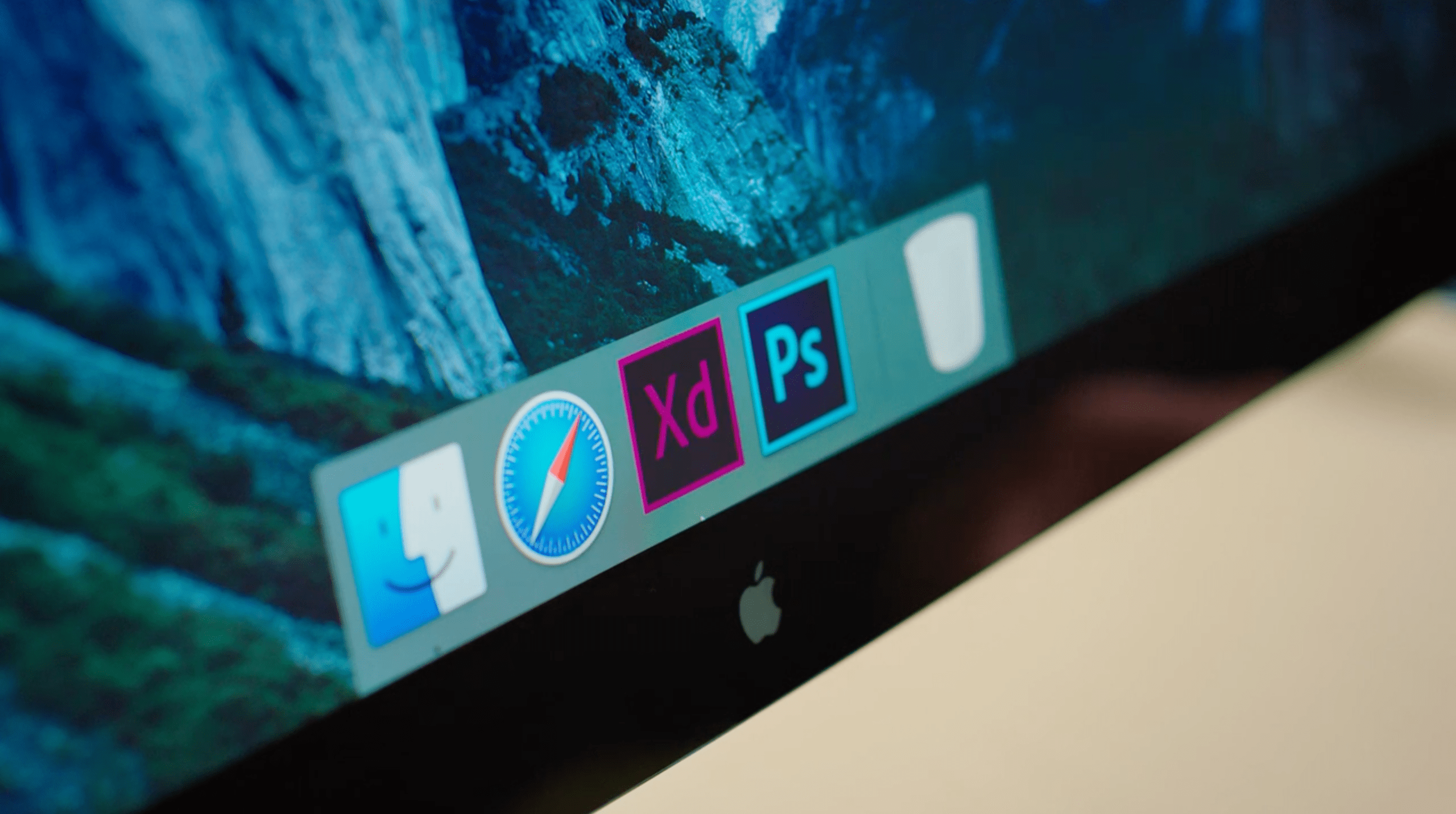
Nu har Adobe släppt en gratis test-release av det nya programmet för alla som har ett Creative Cloud-konto, betalt eller gratis. Till en början är det endast för Mac OS, en version för Windows ska komma senare i år.
Every so often, I’m preoccupied by the question, “Is what I see also what I get?” I catch myself thinking that there’s a discrepancy between what I “saw” and the information my eye actually took in.
The differences between reality, what I see, and what I think I see are especially important to consider when dealing with type. A simple yet fascinating example of a “misperceived” reality can be found in the optical perception of horizontal and vertical bars of the same width. In Detail in Typography, Jost Hochuli states:
For a given weight of line, a horizontal line appears heavier than a vertical line. To achieve optically balanced verticals and horizontals, which appear to be of the same weight, the horizontal must be somewhat narrower. This applies not only to straight lines but also to curves … 1


A veteran of brand, print, and packaging design, Michael Braley has amassed an impressive portfolio of clients, projects and awards. His work has been recognized internationally and is in the permanent collections of the San Francisco Museum of Modern Art, the Chicago Athenaeum Museum of Architecture and Design and The Denver Art Museum.